Assignment 2 - Graphic
Michael Faithorn


Here I've edited the photo within Photoshop using the Hue/saturation tool, I've selected for it to only correct the colour yellow and change both the settings until the teeth appear white, this can be used within photo editing to allow for the best possible look, this could be used to 'exaggerate' a teeth whitening product so that it sells more and also looks more professional and appealing to the customer.


 .
.

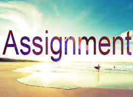
Next I used the clipping mask tool to create this image, I done so by having two separate layers one with the background image and another layer with a separate image on which was masked onto the text 'Assignment' as seen above. This can be used to make text easier to read when layered on top of an image or other bright images.


My next task was to create a better poster design for the 'Gilford Park Youth FC Gillies Club' I created this poster in Photoshop using a wide range of tools such as the shape tool and the magic wand tool to get rid of unwanted background on certain parts of the image, I also used the polygon lasso tool on the shapes to create smooth diagonal cuts on the shapes. I also use the scale/warp tool on the images and text.


Here I've took a picture of the famous DJ Khaled and made it look cartoonish and sketched. On the left is the original image and on the right is the cartoony version after I'd finished creating it on Photoshop, to do this I used tools such as remove colour (ctrl+shift+U) and the blend modes to create a black and white sketch version. Now I added some colours to the image to represent the original image.

Here I've created a colour selected area image, I've used a Shrek image and I've converted it to black and white and used the edit in quick mask tool along with the quick selection tool to select the areas I wanted to keep coloured, I've then inverted the layers colours so that the parts I've selected with the quick selection tool stay coloured while the rest of the image is staying grey scale, this effect is known as colour popping and it allows for certain parts of an image be easier to see.
I've created a new logo for the Carlisle College Computing course, I've used different textures to create a better looking background, I've also used tools such as the shape tool and the blur tool to create a 'blurred' logo, you can also see coloured 'sparks' I found an image and removed the background with the magic wand tool and changed the opacity to add them into the background.
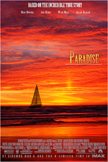
Here I've created a poster for a movie using Adobe Photoshop, I first took a base photo from Google images of a orange sky and also a picture of the sea and blended them together. I also used other tools such as Hue/Saturation, brightness/contrast tools to create a orange colour on the sea to match the sky. I then found an image of a sail boat on the internet and removed the background using the Magic wand tool as well as quick selection tool to clear the surrounding image and just leave the boat, I then changed the opacity down to make it look like its sailing into the sunset; I also used the warp & perspective tool to make it more realistic in sailing off into the sunset. I also used a template image so that I had a design to go off, this helped to make my image look more professional. As for the text I tried to keep the sunset theme going by using a gradient colour of orange and yellow but still trying to make it look readable I also added a black stroke around the text.
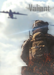
This is the game cover design that I've came up with from using the small brief provided. This game cover uses plenty of different tools which are advanced to create a professional looking game cover which would attract and audience. For the text I've used tools such as the 'Filter' tool and specifically the 'Motion blur' tool; I've created multiple layers of the text 'Valiant' and turned the copies into a 'Motion blur' this is to portray war and how it can be a 'Blur' it also gives a serious affect towards it. As for the sparks, lens flares and smokes I've used royalty free images and used the 'overlay' layer mode to hide the black background and just show the lens flare, this also applies to the smoke and sparks but I also changed the opacity on them so that they're not too bright. As for the soldier and background image I found more royalty free images online blended the two together, I took the picture of the soldier and removed the background using the 'Magic wand tool' and adding on a 'Blending option' of a 'Drop shadow' which create that line dark outline around the soldier. To make the plane blurred in the background I applied a 'Gaussian Blur' to it and changed the radius until I liked it.
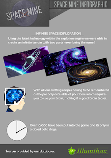
This is the Info-graphic for my project, I've created the Idea of a minecraft like game set in base. I've made it based on fake facts about the game if it were to be released just so that it can be used as an idea. I've used a variety of tools within this infographic such as the shape tool along with the polygon lasso tool to create right angled triangles etc. I've also used 'Filters' such as the pixelate to fit in with the theme of a pixel based game. I also found some free vector images on the internet which I incorporated into my infographic to fit in with the text. I created a company logo by taking a vector image and editing it and adding a company title to make the graphic look more professional and realistic.
M2/D2


You can see the lines connecting the colours together which is the 'banding' because it isn't saved in a rendered in a higher 'Bit'. There are however some limitations of using higher bit colour depths such as; the file size of an 16-bit image is twice as big as a 8-bit image, which would affect performance if you are editing the image on a lower performance PC compared to a 8-Bit image. Another effect of using a lower colour bit can be an artifact known as 'posterization' this is like 'banding' and it looks like this on an image.

Optimising an Image
I'm using Adobe Fireworks as an example on how to optimise an Image for websites because it contains the best advanced settings for doing so. In the image above it is giving me multiple settings I can change to optimise the image and reduce the file size, it also gives me a estimate on how long it would take to load on a certain internet connection so I can keep changing the settings till I get the lowest loading time possible, the only downside to this is the quality will always reduce when reducing the file size so its about finding an even balance. Smoothing is about how 'smooth' the image will look.
In this example the image has maximum smoothing setting and if you compare it to the image above the corners are a lot sharper and more noticeable, using smoothing does reduce the file size but also makes the image look slightly more blurry and might make it harder to see.
Compression
Compressing an image will help to reduce the file size using the tools I showed above such as optimising an image will help to reduce the file size as well, but you can compress a file by using certain image file types such as JPEG, JPEG images are normally compressed so that they're a smaller file size but this leads to the image losing colour and quality so the image may turn out looking worse unlike if you saved it as a PNG for example.

Here I've created a poster for a movie using Adobe Photoshop, I first took a base photo from Google images of a orange sky and also a picture of the sea and blended them together. I also used other tools such as Hue/Saturation, brightness/contrast tools to create a orange colour on the sea to match the sky. I then found an image of a sail boat on the internet and removed the background using the Magic wand tool as well as quick selection tool to clear the surrounding image and just leave the boat, I then changed the opacity down to make it look like its sailing into the sunset; I also used the warp & perspective tool to make it more realistic in sailing off into the sunset. I also used a template image so that I had a design to go off, this helped to make my image look more professional. As for the text I tried to keep the sunset theme going by using a gradient colour of orange and yellow but still trying to make it look readable I also added a black stroke around the text.

This is the game cover design that I've came up with from using the small brief provided. This game cover uses plenty of different tools which are advanced to create a professional looking game cover which would attract and audience. For the text I've used tools such as the 'Filter' tool and specifically the 'Motion blur' tool; I've created multiple layers of the text 'Valiant' and turned the copies into a 'Motion blur' this is to portray war and how it can be a 'Blur' it also gives a serious affect towards it. As for the sparks, lens flares and smokes I've used royalty free images and used the 'overlay' layer mode to hide the black background and just show the lens flare, this also applies to the smoke and sparks but I also changed the opacity on them so that they're not too bright. As for the soldier and background image I found more royalty free images online blended the two together, I took the picture of the soldier and removed the background using the 'Magic wand tool' and adding on a 'Blending option' of a 'Drop shadow' which create that line dark outline around the soldier. To make the plane blurred in the background I applied a 'Gaussian Blur' to it and changed the radius until I liked it.

This is the Info-graphic for my project, I've created the Idea of a minecraft like game set in base. I've made it based on fake facts about the game if it were to be released just so that it can be used as an idea. I've used a variety of tools within this infographic such as the shape tool along with the polygon lasso tool to create right angled triangles etc. I've also used 'Filters' such as the pixelate to fit in with the theme of a pixel based game. I also found some free vector images on the internet which I incorporated into my infographic to fit in with the text. I created a company logo by taking a vector image and editing it and adding a company title to make the graphic look more professional and realistic.
M2/D2
When saving my projects I save them in multiple file formats for certain reasons. I saved them in .png so that I could save them with the highest quality but this also came at a cost meaning that the file size was a lot bigger than if I saved it as a another image type like .jpeg or .bmp, this is because they are more compressed but also leads to a loss in quality. I also saved all files with a .psd extension, this is an exclusive Photoshop file format which keeps all layers separate and allows you to load up the file and instantly continue editing it, I also saved it in .bmp and .jpeg so that they could be used on a website this is because they're more compressed so they have a smaller file size and makes it faster to load on a webpage and its also more compatible.
When looking at the alternate tools I could have used I believe that I used most of the common tools and certain tools which were specific to the task to help create the most professional looking image. As for 'Adjustment tools' I believe I used a good variety of them to create my projects but I could have used the more advanced options within the tools to create a sharper product.
When looking at the alternate tools I could have used I believe that I used most of the common tools and certain tools which were specific to the task to help create the most professional looking image. As for 'Adjustment tools' I believe I used a good variety of them to create my projects but I could have used the more advanced options within the tools to create a sharper product.

Using more advanced 'Adjustment tools' such as the Colour balance tool allowed me to enhance certain colours within the image, in this image I was able to reduce the orange 'Hue' over the image and make the blue sky more noticeable through the clouds, even though I've reduced the orange you can tell easily tell its an orange sunset on the coast, making the image still relative.
Some other tools for the certain projects may have not been suitable for this as they may have been to interfering with the actual image creating too much distraction from the image and not fitting the theme, an example of this tool would be many of the 'Filter' tools if I took the black silhouette of the boat and added a 'Blur' effect to it, it would make the boat unrecognisable and if people looked at the poster they might not be able to work out what the poster is portraying, making the advertisement ineffective.
As for the images resolutions I've used appropriate sizes so that they can be changed and still not have an effect on the quality, an example of this is the Movie poster it was made in the size 40" x 60" with a resolution of 72 pixels per inch, this helped to keep the image looking good, but it wasn't also so many pixels so that the file size became very big. This also means it can be sized up slightly and sized down as well. If you have a low resolution and try to increase the size of the image its going to lose some of its quality and start to appear pixelated or blurry.
I edited all my images using 16 bit colour, this allowed for me to edit at the best possible colour depth and stop things such as 'Tonal Graduation' from appearing which makes the image more likely to suffer from 'banding' which means there wont be a smooth transition between colours as shown below.
I edited all my images using 16 bit colour, this allowed for me to edit at the best possible colour depth and stop things such as 'Tonal Graduation' from appearing which makes the image more likely to suffer from 'banding' which means there wont be a smooth transition between colours as shown below.
You can see the lines connecting the colours together which is the 'banding' because it isn't saved in a rendered in a higher 'Bit'. There are however some limitations of using higher bit colour depths such as; the file size of an 16-bit image is twice as big as a 8-bit image, which would affect performance if you are editing the image on a lower performance PC compared to a 8-Bit image. Another effect of using a lower colour bit can be an artifact known as 'posterization' this is like 'banding' and it looks like this on an image.
Optimising an Image

I'm using Adobe Fireworks as an example on how to optimise an Image for websites because it contains the best advanced settings for doing so. In the image above it is giving me multiple settings I can change to optimise the image and reduce the file size, it also gives me a estimate on how long it would take to load on a certain internet connection so I can keep changing the settings till I get the lowest loading time possible, the only downside to this is the quality will always reduce when reducing the file size so its about finding an even balance. Smoothing is about how 'smooth' the image will look.

In this example the image has maximum smoothing setting and if you compare it to the image above the corners are a lot sharper and more noticeable, using smoothing does reduce the file size but also makes the image look slightly more blurry and might make it harder to see.
Compression
Compressing an image will help to reduce the file size using the tools I showed above such as optimising an image will help to reduce the file size as well, but you can compress a file by using certain image file types such as JPEG, JPEG images are normally compressed so that they're a smaller file size but this leads to the image losing colour and quality so the image may turn out looking worse unlike if you saved it as a PNG for example.